Logo Project
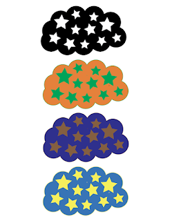
This logo was inspired by my grandfather. He taught my dad all about the stars and constellations throughout his life and now that he is gone, my dad passes this knowledge onto me. This is a big part of who I am.
The top logo is black and white, the black cloud to represent the night time, when the stars are brightest.
The second logo is orange and green because these colors represent tranquility, which are the feelings I get from looking up at the stars.
The third logo is brown and dark blue to capture the trust and stability that the stars hold since they are always there whether you can see them in the daytime or not.
The last logo is light blue and yellow because they are European signs of happiness and soothingness because my grandfather was of full European descent as his father moved from Italy to the U.S. on his own so it feels very fitting.

Comments
Post a Comment