Posts

Final Portfolio!

Image
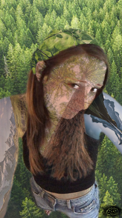
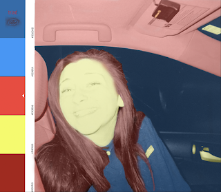
  This is my final portfolio for FMX210. I am very proud of this final product. I wanted to show who I am through the colors and I think I accomplished that. I picked earthy tones that express my roots in nature, the woods, and hiking. This part of me is reflected in many of my media projects so I thought it was only fitting to keep that theme here as well. I included pictures of me or where I grew up whenever possible like the covers and the about me page. I am overall super happy and thankful that I got put into this class at the beginning of the semester because I have learned and grown so much! I came to UT as an undecided major and I declared about halfway through to a design major and I think that this course helped me realized that I do enjoy digital art!

Business Cards

Image
       Above are all three of my business cards. I made these by using Adobe InDesign. I enjoyed making them because it made me feel like I was a professional by nearing the end of this course, FMX 201! I am super proud of my logo, fonts, and the colors I chose because I feel like they express who I am and my hard work. I chose the colors for the clouds initially to represent myself based on meanings like tranquility or optimism. I then chose the other colors and fonts accordingly to compliment each other and have a cohesive final product. It was important that these look good because if this was what I handed out to people in order to get in touch with me, I would want myself to be represented correctly, which these do!

Adobe InDesign Tools

Video : https://www.youtube.com/watch?v=AshfNo-i8Ws Arrow Tool  (0:18 - 0:25): used to select objects This tool is used to select objects and move them around. It is the most basic of the tools as it is also in photoshop and illustrator like we have already used in this course. It will be easy to use this tool to move my objects around to place them right where I need them! Direct Selection Tool  (0:38 - 0:45): select individual objects (drag points of shapes) This tool is very similar to the arrow tool but it can make more precise changes. This tool is also used in photoshop and illustrator so it will be easy to use as well. It is helpful to use this tool to create your own shape or edit shapes I have already made. Pen Tool (2:00-2:20): creates unique shapes This tool is used to make your own shapes from scratch! I am very grateful that we used those games at the beginning of the illustrator unit so I could better understand how to use this tool otherwise it would have been very diff

Autoscopy

Image
 This is my autoscopy project! I am very proud of how this came out. I chose to blend myself into nature because the outdoors has always been my safe place. It is what grounds me when I feel myself slipping. I used masks to delete the excess of each picture to cover one body part or object. Nature has made me who I am today and I realized recently how important it is for me.

Somewhere

Image
  This is my somewhere project! I chose to photoshop myself into the show Seinfeld. I grew up watching this show by default since my parents loved it and now I have been rewatching all the episodes. It's a classic show and I am glad I was able to put myself into it!

Pre-Somewhere

Image
https://www.instagram.com/kirbyjenner/?hl=en  : I think the above picture would be very difficult to photoshop myself into considering the color scheme, lighting, and the clothes I would need to match the setting.   https://www.instagram.com/averagerob/  : The above picture gave me an idea for the "Somewhere" project because I think it would be a very cool idea to photoshop myself into a scene with animals that I have never gotten to see, like monkeys in a jungle maybe. https://www.boredpanda.com/funny-photoshop-troll-james-fridman/  : This photo made laugh 8-) https://www.boredpanda.com/reality-behind-photography/  : I may want to recreate an illusion like this! I think it would look super cool and I have a mini skateboard that I could possibly use as a subject.

BW to color!

Image
  Here are my black and white to color pictures. The bottom is the original picture just in black and white. The other three are my re-colorations. I am very proud of how this project came out. It took me about 6 hours to do all three but I think all of that time really paid off. The original photo is from a disposable camera so it was naturally washed out which I think works very well with my color palettes. It does look like I used the same color for each item in the monochromatic and analogous pictures but I did go through into each individual object with a different shade from the colors on the side. It was so enjoyable to re-color this picture any way I wanted. I chose the green monochrome colors because green is my favorite color so it would describe me well. I chose the analogous colors to switch it up since pink and purple have never been my go-to colors. And then I chose the triad colors to have some good contrast in the picture! Despite the time commitment, this has been my f