Posts

Photoshop Tag Brush

Image
  Above are is my tag brush that I created in Adobe Photoshop. I used my logo created in Adobe Illustrator to be the center of my tag. I then chose the spray overlay because it reminded me of clouds since it was more concentrated and grainy than the other options. I really like how it turned out and the top picture is what my stamp looks like in different colors and layered on top of eachother.

Photoshop Beginner Tools

 Move Tool: https://www.youtube.com/watch?v=2cQT1ZgvgGI (1:00-1:20)      This tool allows you to move an unlocked layer around. This tool is very straightforward and easy to use. It will be very helpful when having multiple layers so I can adjust them to where I want them. It can come in handy as well if the layers are not lined up the way you envisioned or could be cool to create a ripple effect with the layers. He says it is probably the most used tool in photoshop so I assume I will be using it very often. Artboard Tool: https://www.youtube.com/watch?v=2cQT1ZgvgGI (1:25-2:15)      This tool allows you to crop your main image into one smaller artboard. This is perfect for cutting out unwanted blank spots or details in you work. What is cool about this tool is that you can continue to create as many artboards as you want on one canvas. This gives your art a collage kind of look and I think I could use it to use the same picture on each artboard b...

Self Portrait/Propaganda Poster Project

Image
 Above are both my self portrait along with the final outcome of my propaganda poster. I spent a lot of time perfecting my original self portrait and I am very proud of how it came out, I think it does look like me. The hardest part about it was doing the eyelashes, to me it makes my portrait look scarier than it was meant to be. I take pride in my propaganda poster as well because I really like how it came out and the message it gives off. I chose "free your mind" to be my propaganda because I hope to provoke creativity out of people with this image. I also like the color choices because they really grab your attention (not to mention that the blue and red heads remind me of 3D glasses).

Logo Project

Image
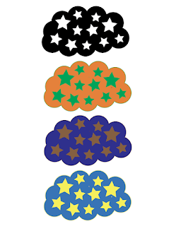
 This logo was inspired by my grandfather. He taught my dad all about the stars and constellations throughout his life and now that he is gone, my dad passes this knowledge onto me. This is a big part of who I am. The top logo is black and white, the black cloud to represent the night time, when the stars are brightest. The second logo is orange and green because these colors represent tranquility, which are the feelings I get from looking up at the stars. The third logo is brown and dark blue to capture the trust and stability that the stars hold since they are always there whether you can see them in the daytime or not. The last logo is light blue and yellow because they are European signs of happiness and soothingness because my grandfather was of full European descent as his father moved from Italy to the U.S. on his own so it feels very fitting.

Calligram Project

Image
 This is my final product for the calligram project. It was inspired by my love for hiking and the woods. A lot of my creativity and inspiration for the way I live my life has come from the nature I grew up around so I wanted that to be reflected in my project to always keep in mind my beginnings as I embark on my future. The tools I used was primarily the warp text tool. I used this along with the darker green tones to give the look of pine needles that come together to make pine trees. I used different shades of blue rectangles in the background to give depth and I used opacity to help them blend together. Overall, I am proud of this project because it reflects what inspires me everyday. My letter to my future self:

Illustrator Tool Tutorials

Text Tool (link to video: https://www.youtube.com/watch?v=0EwMxIc2RTk) :       This tool seems mostly straightforward and easy, much like text tools in other medias such as photoshop, google slides etc. To get a basic text box of any size, you just click on the "T" icon on the left and drag diagonally until you have the box of your liking. This can be used to put any kind of title, statement, or general wording throughout my project. Also, this tool has many other unique uses which may be a little bit more difficult to maneuver at first. Point type is one of these features and how it works is just by clicking a spot on the screen, your text will pop up there without you needing to make a text box. You can also make text in a shape, the example she shows is in a rectangle, the words follow the perimeter of the box which is very cool and I would love to incorporate that into one of my projects. Ellipse Tool (link to video: https://www.youtube.com/watch?v=1GWVpfxk2oM) ...

Canvas Project!

Image
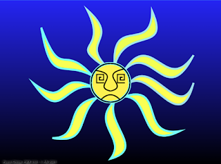
       Above is my final product. I am very proud of how it came out! This is my first time coding and it was definitely a rough start. It took me a total of 8 hours to complete this design.      This design was inspired by one of my favorite bands, Sublime. I really connect with their music and this album cover (shown below) from their "40 oz. to freedom" album is an image that has stuck with me ever since I saw it for the first time. I knew I wanted to create something at least loosely inspired by it so the paper shown below that is my own interpretation of the original art. https://upload.wikimedia.org/wikipedia/en/5/57/Sublime40OztoFreedomalbumcover.jpg Original Sketch:      A did run into a big obstacle during this project. This happened when I was making all 9 of my rays, coming off of the center circle. I had been making them by putting two separate bezier curves next to each other and then connecting them at the ends. This worke...